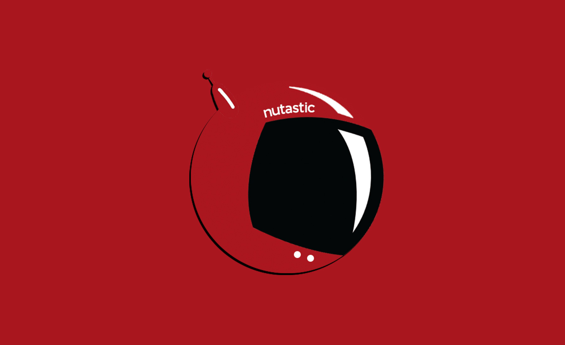
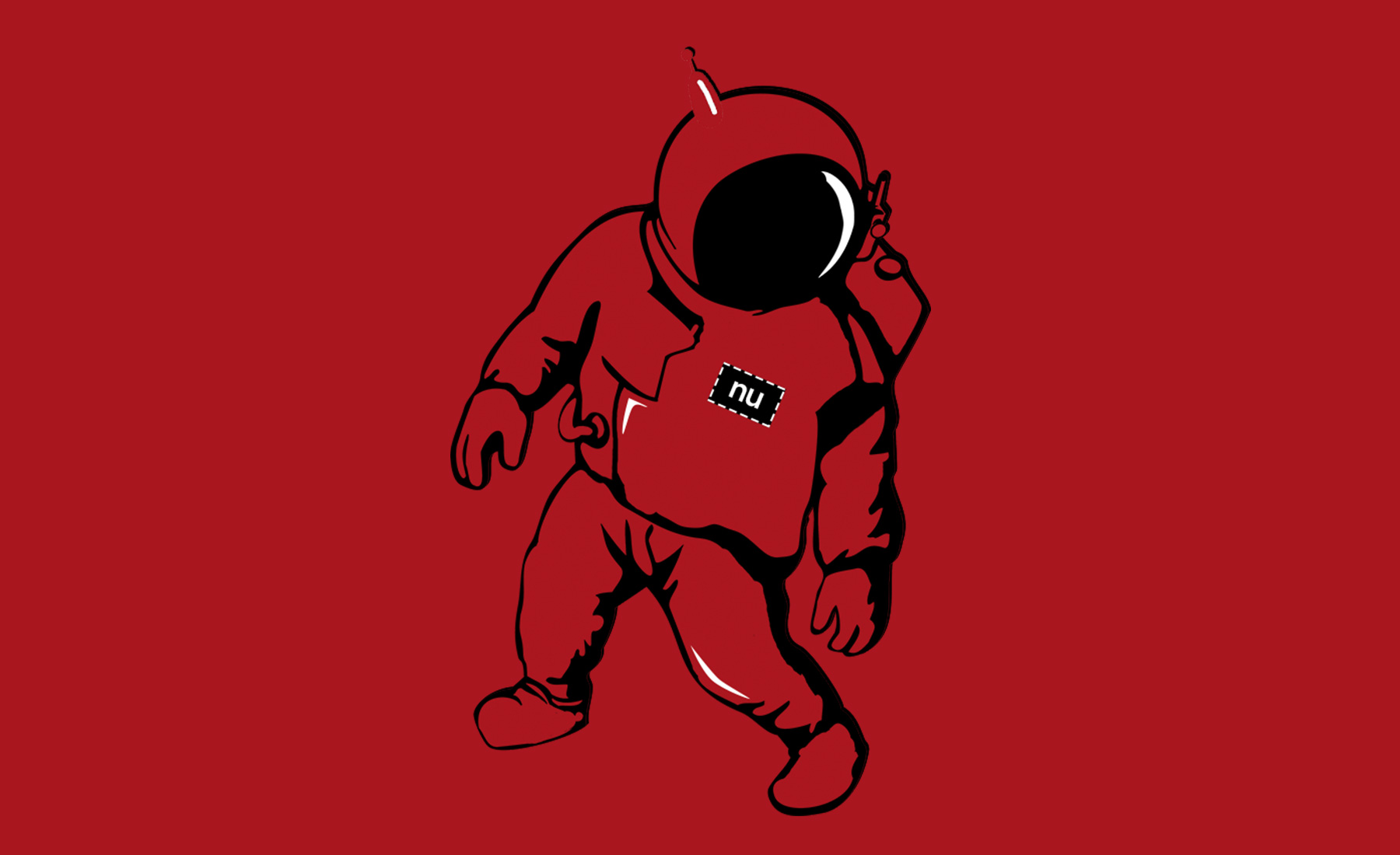
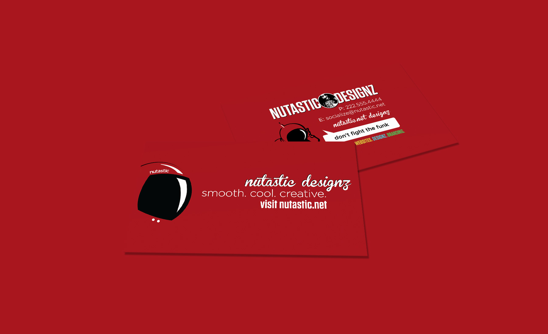
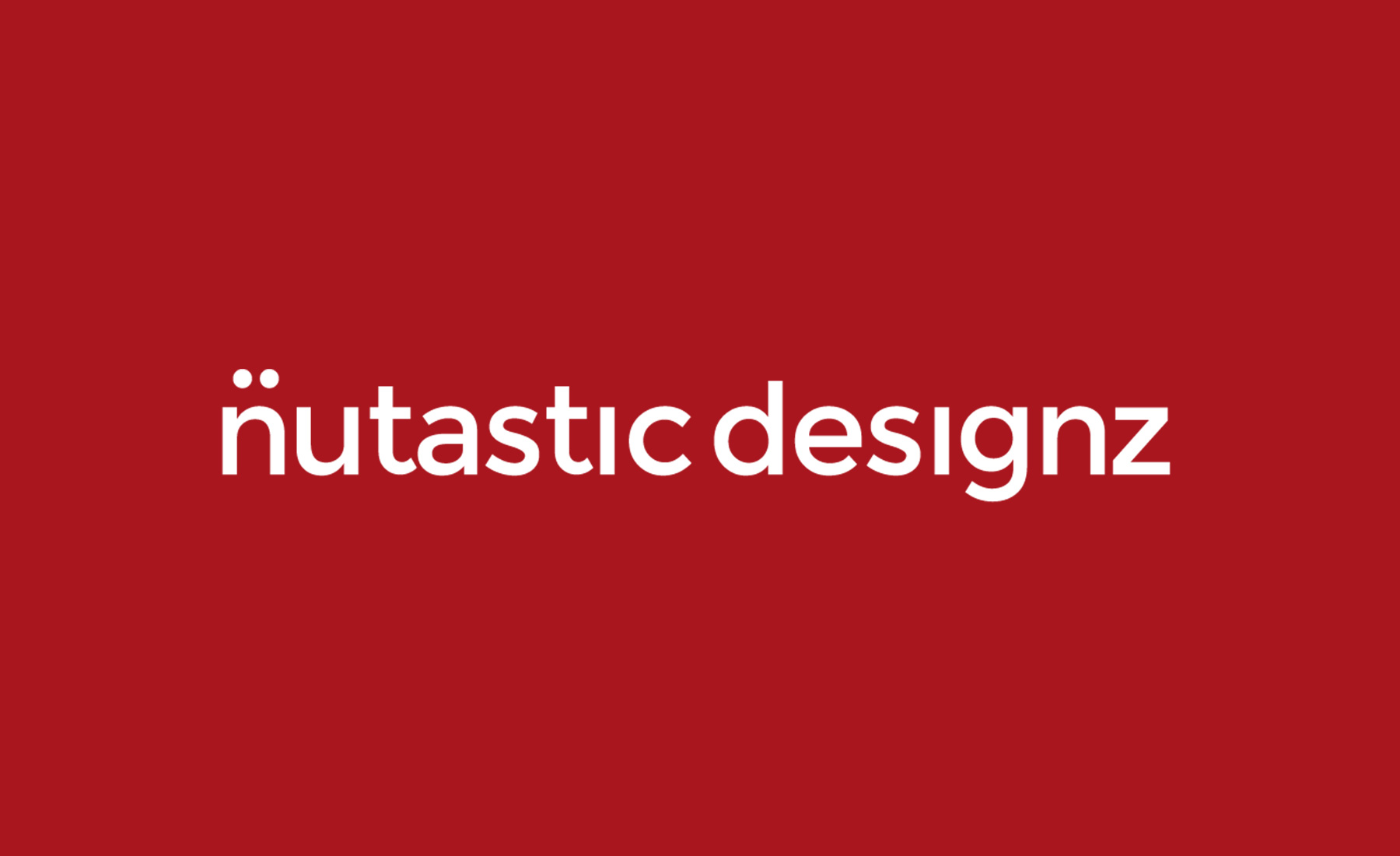
We decided to re-brand our look to start the #nu year off. We upgraded our space helmet design (which previously had not been worked on since 2010), and the font-styled logo. We also solidified a new shade of red with our space character, logo, website, and business cards. The re-branding of our system allows to present a cooler, cleaner, fresher look on top of our creative touches. The new look will prove useful as we continue branding ourselves on our print designs, shirts, social networks, website, and more!
Read more about our #nu branding and re-design in our
2014 Nu Upgrade Showcase.